Bush, the debt, Mankiw and spin
An 'econonerd friend' of Greg Mankiw's in the White House emails him with this analysis. Greg posts it approvingly, and I am fuming. Yes, Senator Conrad's analysis is misleading, but he is a politician - I've long learned to not seek insightful economic analyses in public statements by that lot. Last time I checked, however, Greg Mankiw was still one of the brightest stars of the economics profession and higher standards apply.
Let the econonerd speak:
Yes, the federal debt is higher than when the President took office. Debt in 2001 = 35.1% of GDP. Projected debt in 2009 = 37.9% of GDP. [...] Measured as a share of the economy, it's about 8% higher than it was when the President took office. (37.9 - 35.1) / 35.1 = 8%
Debt as a % of GDP stood at 35.1 at the end of fiscal 2000. But, as Senator Conrad reminds us, the budget is presented by the president outgoing, so GW Bush did not inherit the debt at 35.1% of GDP: he inherited it at 33% of GDP, where it stood at the end of fiscal 2001. (37.9-33)/33 = 15%.
So how did G.W. do compared to his predecessors? I multiply 15% by 8/7 to estimate an overall effect of Bush on the debt, as well as double the number for Presidents who only served one term (so that I can compare like with like). 'Kennedy' covers both the Kennedy and Johnson presidencies, and 'Nixon' covers Ford's presidency too.
Here's the effect each administration had on public debt as percentage of GDP:

George W. is slightly better than his dad in terms of not-increasing-public-debt-by-very-much, and he shines compared to Reagan. Eisenhower and Nixon/Ford actually reduced debt as a % of GDP (albeit by less than the adjacent Kennedy/Johnson and Carter administrations respectively), while Bill Clinton can boast the largest reduction since at least Kennedy/Johnson.
So, historically speaking, W. Bush only performs 'well' compared to the worst performers, Reagan and his dad, both Republicans (note that all Democrat Presidents achieved significant reductions in debt as % of GDP during their terms)
And there's more:
[Chairman Conrad's presentation is misleading in that it includes] no comparison to the historic average - It's relevant to compare our federal debt [held by the public] with historic averages, to see if we're in a lot of debt relative to where we've been in the past.
Here's the graph the 'econonerd' - (by this stage I believe a more accurate description would be econospinster') posts:

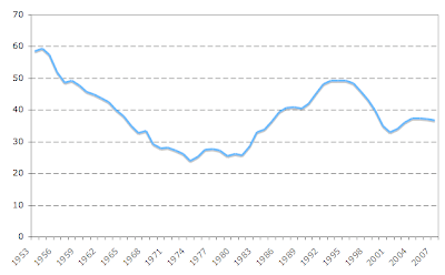
And here is the same series going further back:

'Debt is near the historic average'?!? The series goes all-over the place, so 'historic averages' are mostly driven by the time window chosen. Choose the number of years that suits you, and you can claim that current debt as a % percentage of GDP is higher/lower/equal to the long-run average (going back beyond 1953 makes this even more interesting). Why not calculate a historic average going back 30 years? (the decision to not go back further than 40 years probably has to do with the fact people would start thinking WWII). The econonerd also missed the killer point here: why not compare US Federal debt with Italian public debt? (do I have to do your work for you?)
Also, note that choosing to start your graph at 1991 creates a nice 'debt ain't that high' visual effect. (the first person to propose a plausible-sounding reason why 1991 should be the choice of a starting point for a 'debt under Bush' graph wins a White House 'economics' job).
And finally, a question for Bluematter. readers: Is "almost doubling" an inaccurate description of a 79% increase? This is not a trick question, looking forward to your views in the comments section.
Update: Andrew Samwick has another objection, via Angry Bear.